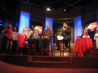
As it turned out, Radio Broadcaster, Sportswriter and Washington Baseball Historian Phil Wood showed up for today's Uniform Unveiling at The ESPN Zone in downtown Washington, DC. After the presentations ended--Phil was kind enough to again share some time and thoughts with me--about the new jerseys.

“I like the new road jersey, I think it is a kind of traditional looking and reminds me a little of the Montreal Road Jersey of the last few years up there (in Canada). The flourish under the “Washington” is like the flourish under “Senators” back in the expansion years. The number on the front of the blue alternate “DC” jersey is TOO BIG. It’s just ENORMOUS. It needs to be a little bit smaller.”

“Taking the patch off the sleeve and putting the big “DC” there (on the sleeve)—I kind of like the patch look better than the big “DC”. I don’t know. The Dodgers had that big “LA” on their sleeve and that is what it reminds me of. But I would love to see somebody, beyond The Red Sox, The Yankees and The Giants, have a home jersey that just has their number (on the back) and not the player’s name on the back. It might sell some more programs to start with (chuckling), but that is a nice, classy, traditional look.”
“The number that The Yankees wear is an 8” number. I think it is the same for the Red Sox. The Senators actually wore a 7” number back in the 1960’s. It was a little bit smaller. It was centered on the back on the jersey. One problem The Giants have is that they don’t have names on the back of the jerseys, but the number is mounted low enough to put a name back there. Where as, if you are not going to have a name on the back, and this is a real technical thing, but you sew on the letters on the back where it is 5 & ½” inches below the collar—well they (The Giants) are sewing it on about 10 to 12 inches, so the number (bottom) is almost at their waist.”
“Hey, I am real anal about uniforms, as you can guess (both of us laughing).”

So, then what do you think about the new Washington Away Jersey—the back numbers are different because they have the gold trim—the front doesn’t have the same?
“Well, again, you can look at The Dodgers with the red number on the front and nothing else they wear has red on it. Let’s just wait and see what happens by the time the season starts and see if that hasn’t changed by then. I think that is always a possibility. But it really comes down to the fact that these things are designed in the office of Major League Baseball. They are not designed by anyone here. Back in ’87, I was part of a group of about three or four people who redesigned The Orioles Uniform they started to wear in ’89. They (The Orioles) wore it between ’89 & ’94, and I still think that is still the best uniform The Orioles wore. But what we had, in terms of samples, all kinds of weird looking things. We had one that looked like a St. Louis Browns Jersey—which I really liked. Anyway, I think it would be nice if the design could be taken out of the hands of Major League Baseball and say (The Team) we are going to do this ourselves.”
“I would love to see The Nationals come up with an alternate home jersey that is pinstripe. Washington teams wore pinstripes for years. So, a pinstripe jersey with “Nationals” in say one color, or without the gold trim, in navy with red trim—I think that would look really sharp. Again, it would be an alternate, you wouldn’t wear it real often. It’s a personal thing.”

Some fans have said they don’t like the Block Nationals with Gold Trim in front (on the home jersey) with the Red Curly “W” Cap? (SBF)
“Well, the Curly “W” is here to stay. I think that it’s branded everywhere in the stadium. That (Logo) is going to be around in 25 years. It’s one of those things, if they went with the (Block) “W” that use to be on the road jersey, I think that would be a little harsh. This (Gray Away) has, I don’t know, a happy look to it. I don’t know why I think that. That is what it seems like to me.”

What about The Patriotic look? Many have already mentioned on my blog they don’t like it. (SBF)
“Well, it’s a nice thing. I think the “DC” is too big. And the number on the front is TOO BIG. But, maybe again, that’s just a sample and maybe that will change. I just think it’s so big, it almost looks cartoonish.”
But overall, what do you think about that “DC” Jersey and the others? (SBF)
“They are OK with me.”
3 comments:
I couldn't put my finger on it about that blue jersey, but Phil hit the nail on the head. Too big!
It's like they made a design that was too busy, then enlarged it "so all the detail could come through."
I hadn't picked up on it either, but I think that Phil is right about size. I also agree with "Teddy" that the decision to go larger with the logo likely was made because of the detail in the design.
I don't think that the DC is too big - It's just a crappy concept. Please, no blue alternate jersey!
Post a Comment